YoBe is a California-based brand producing plant-based, keto-friendly and gluten-free protein yoghurt snacks.
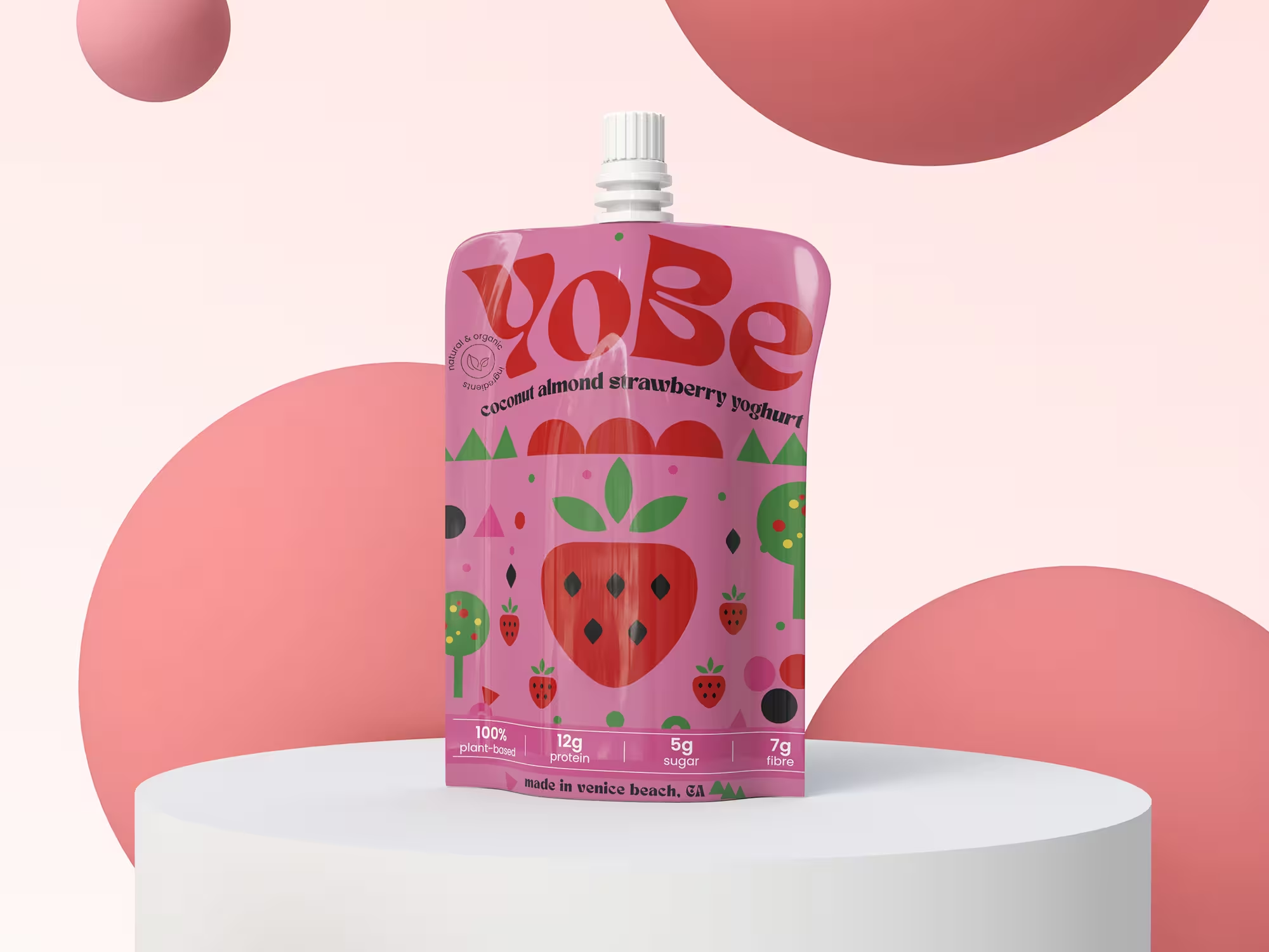
As part of a speculative 99Designs competition brief, participants were challenged to redesign the packaging for YoBe’s Coconut Almond Strawberry Yoghurt pouch.
The objective was to create a more distinctive and memorable brand experience while appealing to health-conscious consumers, including athletes, vegans, families and lifestyle-focused audiences. The project provided an opportunity to explore how visual identity, packaging systems and information hierarchy could strengthen shelf presence in a competitive food and beverage market.
The Problem
The existing packaging relied heavily on lifestyle photography and followed many of the visual conventions commonly seen within the health-food category. While the product benefits were visible, the overall identity lacked distinction and risked blending into a crowded retail environment.
My hypothesis was that a simpler, more memorable visual system could create stronger shelf impact, improve brand recognition and better communicate YoBe’s playful, modern personality.
Constraints
The project was completed as part of a live 99Designs competition brief. The existing product, flavour and nutritional information needed to be retained. Only a single concept was submitted.
The solution needed to appeal to a broad audience while remaining relevant to health-conscious consumers. The project was completed within a limited timeframe of approximately one day.
My Role
Brand Identity Designer and Packaging Designer
Responsibilities included: Concept development, Visual identity exploration, Packaging design, Information hierarchy, Packaging system thinking and Presentation and submission.
The Process
I researched contemporary packaging trends and explored how illustration, typography and colour could create a stronger shelf presence. Moving away from photography, I developed a simplified visual system designed to improve recognition, scalability and brand differentiation.
Key Work
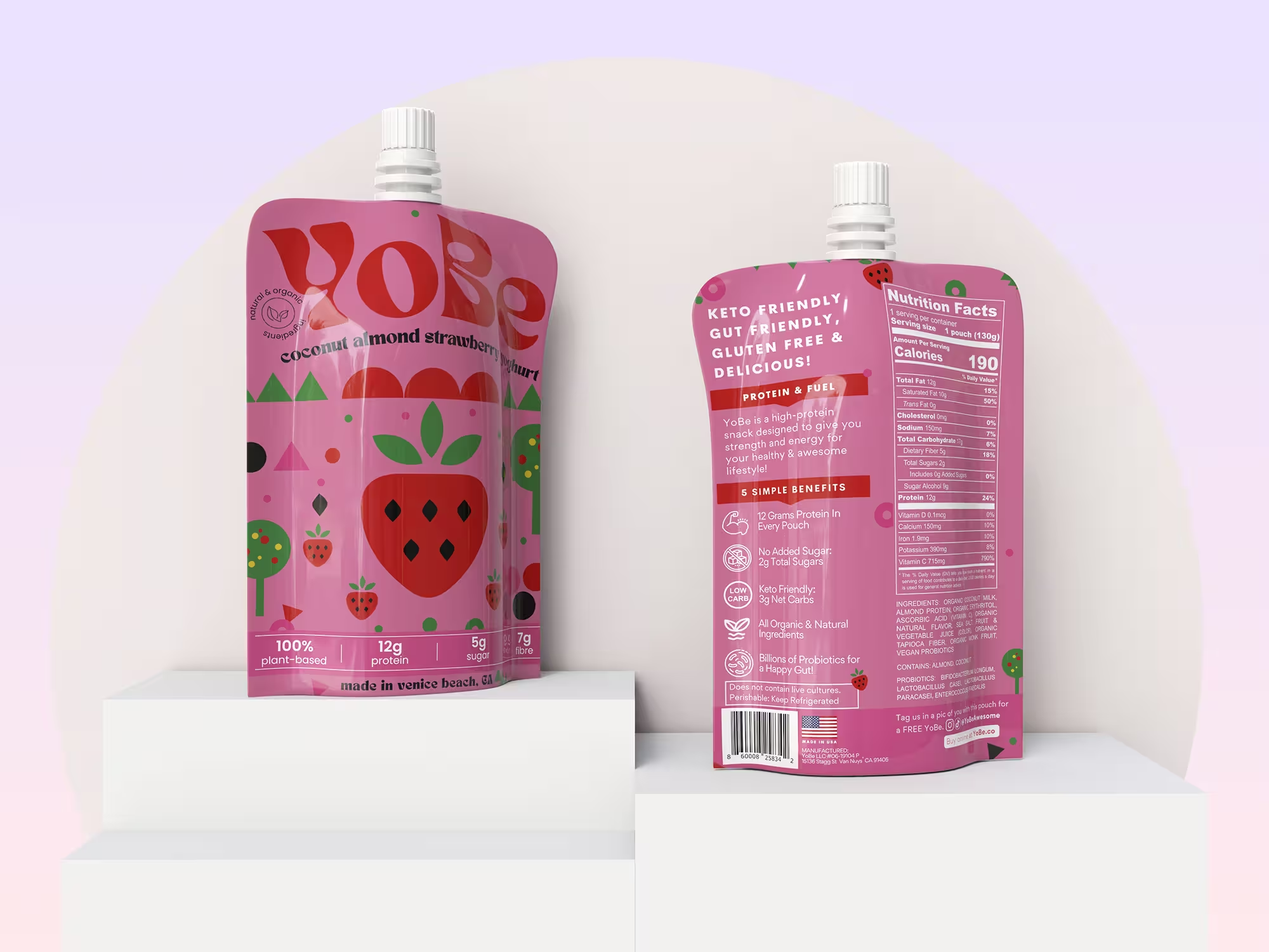
Created a Distinctive Visual System: Developed a graphic language built around simple geometric forms and playful fruit-inspired illustrations.
Moved Away from Lifestyle Photography: Replaced stock-style imagery with a scalable illustration system that could be extended across future flavours and products.
Improved Information Hierarchy: Reorganised key nutritional information to make protein content, flavour and product benefits easier to identify at a glance.
Strengthened Brand Recognition: Introduced a bolder typographic approach to create greater shelf impact and improve memorability.
Outcome
Although the concept was not selected as the winning submission, the project remains a valuable exploration of brand differentiation, packaging systems and visual storytelling.
The work demonstrated how a more distinctive identity could help a challenger brand stand apart in a saturated category, while creating a scalable foundation for future flavour variations and product extensions.
Reflection
This project reinforced the importance of designing for recognition rather than simply following category conventions. Looking back, I would further develop the illustration system to draw more inspiration from the Venice Beach lifestyle and culture referenced by the brand, while retaining the simplicity and scalability of the original concept.
It also highlighted a principle that continues to influence my work today: strong design systems create consistency, flexibility and recognition across every customer touchpoint. Whether working on packaging, digital products or websites, I aim to create solutions that are both memorable and scalable.
Key Skills Demonstrated
Brand Differentiation, Audience-Centred Design, Information Architecture, Design Systems Thinking, Visual Communication
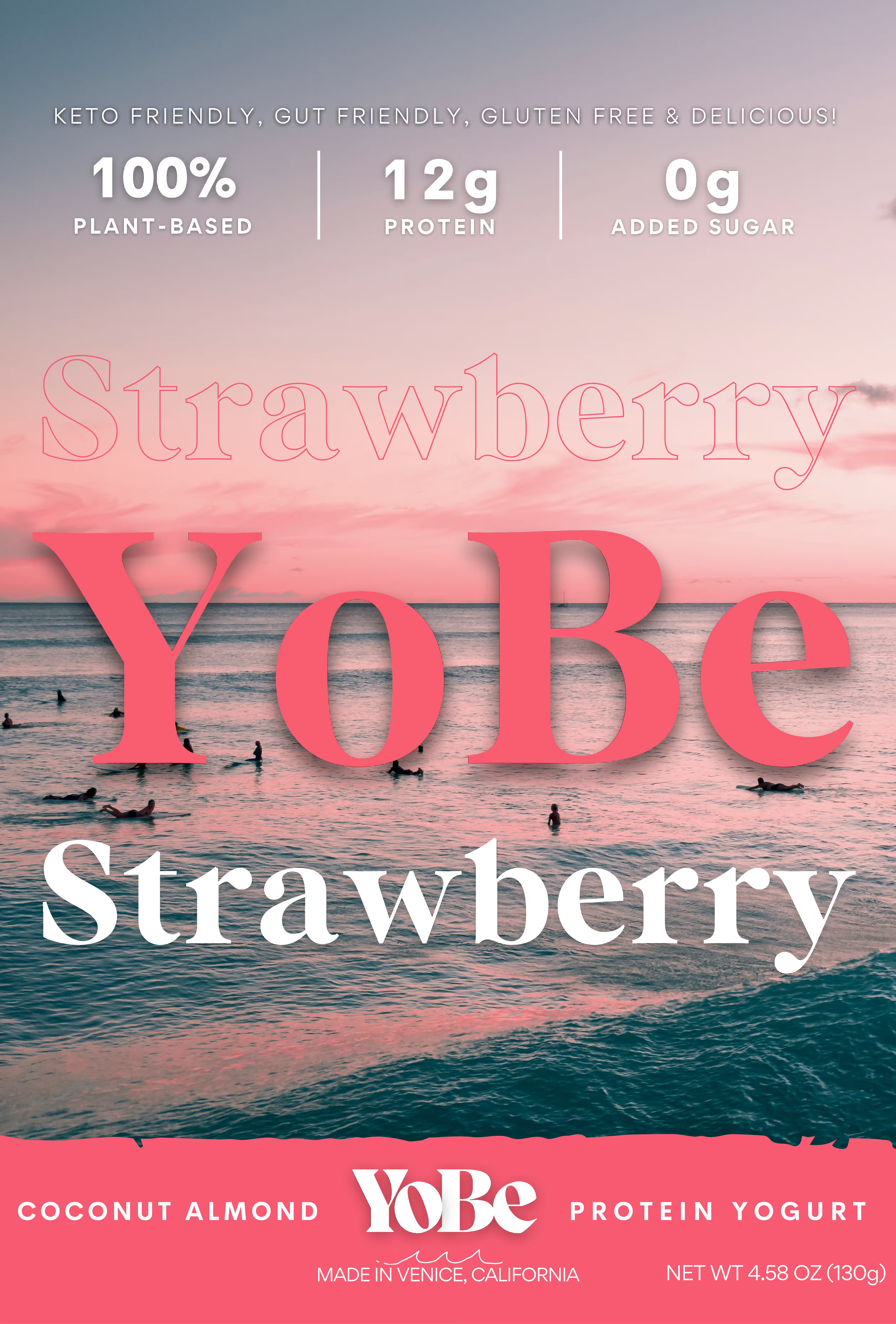
Before
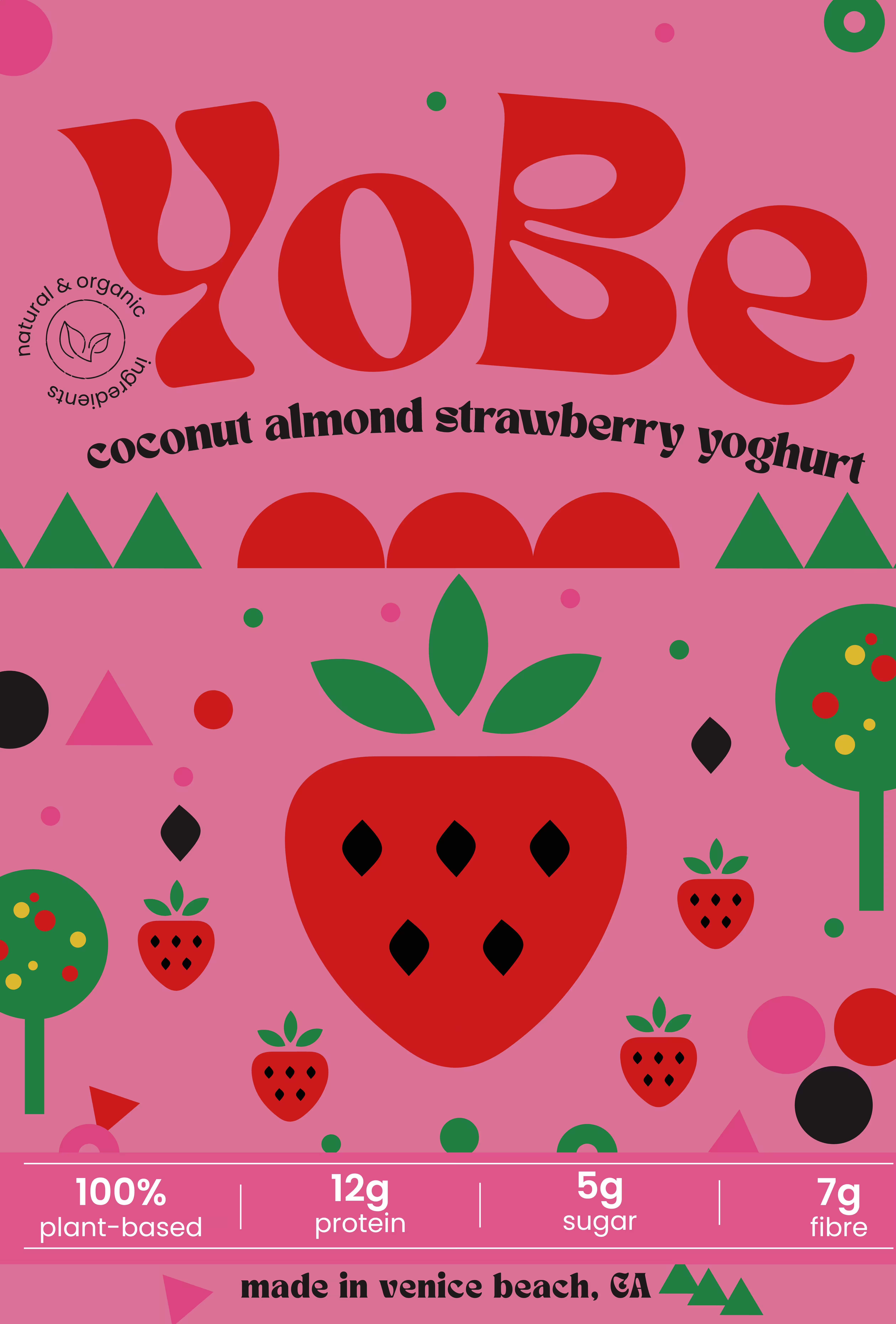
After